Website Homepage: Must-Have Features
Your homepage isn’t just there to look pretty. It’s not a digital billboard for your business. It’s your clinic or studio’s online front door, and the moment your ideal client steps up to it, they decide whether to come in or keep scrolling.
Truthfully, if your homepage doesn’t tell people who you are, what you do, and how to work with you in the first ten seconds, it’s just a glorified and expensive screensaver.
Take your website from collecting dust like a business ornament and use it to convert browsers into bookings.
Let’s break down exactly what your homepage needs to have if you want it to stay relevant to your ideal audience and Google, which decides if you should be found on its front page or buried on page two or further back.

Introducing…The Homepage Method
It's a balance between letting visitors scroll their way through your website, and creating a clear journey for them so they don’t get lost. Why? Because not everyone who lands on your homepage is ready to commit. Some want to browse. Some are curious. Some are deep in research mode.
In our 10+ years of designing standout Squarespace websites, we’ve figured out what works when it comes to captivating your website visitors and getting them clicking in all the right places. We call this The Homepage Method, a tried-and-true system we wish everyone DIY-ing their website knew, to ensure their website is not just beautiful, but also brings in business.
So, how can you implement The Homepage Method? Instead of relying on your menu to direct your website visitors to where they might want to go, it’s about designing a homepage that gives them bite-sized previews of each significant section of your site. Think:
A short intro about you, with a "Read More" link to your About page, so they can get to know you in more detail.
A summary of your top services, allowing them to take a deep dive on the ways to work with you that align with their needs.
A summary of your latest or top blog posts in a carousel, or highlighting your resources or top-products to share more of what’s available to them.
Testimonials, before-and-after or case study snippets to show you know what you’re talking about and build trus.
This creates momentum and lets them explore based on what matters most to them. It’s intuitive, personal, and keeps them engaged longer.
A Clear, Client-Centric Headline
Clever is cute. Clarity is better. Your headline is prime real estate. It sits right at the top of your homepage and sets the tone for everything that follows. If your dream client lands on your site and can’t figure out in a few seconds who you help and how, they’re gone.
What works best? Client-focused language that spotlights the transformation you offer, and calls out exactly who it’s for.
Example for a wellness practitioner:
"Nutritional support for busy mums looking to regain their energy naturally."
See how that headline speaks directly to the client’s struggle and offers a clear solution? That’s the goal. It’s not about sounding fancy. It’s about being understood.
Need some bonus points? Make sure your SEO keywords are included in this headline, and that you’re using ‘H1’ styling. Trust us, Google wants it this way, and will love your page further up the rankings.
A Punchy Subheading That Backs It Up
Your hook needs a copilot. Your headline is there to grab attention; your subheading should immediately provide more detail and support. This is your space to build context and trust without overwhelming your new website visitor.
Your subheading can provide additional depth and direction to your headline, highlighting your unique approach, credibility, or what sets you apart from others.
For example, if we were creating a supporting subheading for the above headline, it might be: "Ditch restrictive diets and relying on supplements. Learn to balance your hormones with natural, budget-friendly, easy-to-follow food advice and everyday grocery items.”
A Strategic Call-to-Action (CTA)
If there’s no button, there’s no booking. Your homepage should guide people. If someone is ready to book or learn more, make it ridiculously easy for them to do so. When deciding on your primary CTA, consider what the best first step is for new customers. Yes, you want bookings, but does your potential new client have all the information they need to make that their best next move?
Once you’ve decided on your primary CTA, place the button right under the headline, utilising action-provoking language that speaks to the outcome they can expect by taking action.
For example:
"Book Your Initial Consult"
"See How We Work"
"Start Your Fitness Reset"
“Take Our Ultimate Skin Quiz”
Don’t make them scroll or guess. The clearer the path, the faster the conversion.

Example of a header banner with Headline, Subheading and CTA. From gillnichollsnutrition.com
Visuals That Build Trust (Not Just Vibes)
Pretty doesn’t pay the bills. Proof does. Yes, aesthetics matter, but authenticity matters more. The photos you use on your website’s homepage will help build credibility and connection. Your homepage should include visuals that make visitors feel like they’ve found a real person they can trust.
What works:
A photo of you smiling in the space where you meet or treat clients
A short video explaining your philosophy
Background images of you interacting with clients
For a Pilates studio? Show the space, your instructors in action, or a class in motion. Your dream client should be able to imagine themselves fitting in there. If you’re a skin clinic, get your team involved and have real-life clients interacting.
Don’t fall into the trap of thinking that by capturing picture-perfect people, you will present better. Authenticity is felt and can’t be framed. Show who you are, who you work with, and all the shapes, special features and sizes they come with.
Show them you’re legit without having to say it. Check out our guide to planning a brand photoshoot that will work for your website.
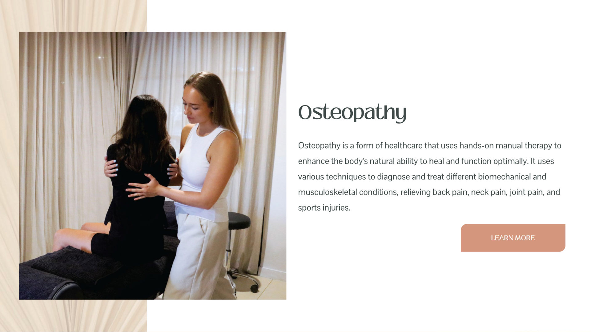
An example of client-centred imagery from Tugun Osteopathy.
A Service Snapshot That Skims Well
What you do, without the waffle. You want your site visitors to quickly get the gist of how you can help. This doesn’t mean dumping your entire service page on the homepage. Think of this space as the movie trailer.
Use simple headers and short blurbs that focus on benefits:
Example: "Initial Consultation"
A 90-minute deep dive to uncover the root cause of your symptoms and create a personalised wellness plan.
"Follow-Up Appointments"
Ongoing support to adjust your protocol and help you stay on track with confidence.
Visual icons or a clean layout help create an easy, skimmable experience. They should get the message without needing to slow down. Don’t forget a CTA for each service, to help them dive deeper into understanding what it entails. We cover all the essential pages your website needs in this blog post.

Example of a Skin Clinic’s services section from The Skin Manifesto
Social Proof That Sells Softly
Don’t just say you’re good, show it. Your homepage is the prime space to highlight what your clients are saying. Testimonials build trust, especially when they echo the exact struggles and wins your dream clients care about.
What works:
A quote about how someone went from overwhelmed and exhausted to calm and energised.
A mini story about a transformation.
Before and after photos that show real results from your clients.
Keep it real, and include names and photos if possible. It humanises the results and builds credibility. We’ve covered the essentials for collecting social proof for your website in this blog post.

Example of testimonials displayed in an interactive slider on The Skin Manifesto.
A Low-Barrier Offer or Opt-In
Let them fall in like, before they fall in love. Your homepage is a great place to capture leads who aren’t ready to book. Offer something valuable that solves a small problem or gives a quick win.
Examples for wellness brands:
→ "The Simple Guide to Fussy Eaters " PDF.
→ "7-Minute Morning Stretch for Busy Business Owners" video.
→ "Mini Skin Audit Quiz" to assess their skin type.
Frame it as a helpful resource, not a sales funnel. When it feels generous, not grabby, people are more likely to opt in.

Example of an opt-in offer / lead magnet from Pilates studio, The Body Method
A Note on Your Homepage Copy
It might surprise you to learn that when creating and designing a website, setting up your homepage is not actually first on the list! It’s not even second or third! (Pssst… we talk about all the steps to creating your website – and what it costs – in this blog post).
We often say that copy dictates design, but if you’re using a professionally designed template, it can give you a guide on how much to write for each key section. Before jumping into your homepage redesign, it’s a good idea to review your copy first. Key things to consider include:
Are all your headlines skimmable? If they were only to read them, and no supporting text, would your website visitor know exactly what you offer and where to go next?
Keep it simple. There’s no need to overwhelm your audience with all the details. Keep your descriptions succinct and to the point, including plenty of CTA’s for them to go deeper into the areas of your website they most want to explore.
Include keywords. Your homepage is SEO gold, so make sure you’re utilising juicy keywords at every opportunity to maximise your likelihood of getting found through search engines.
Ready for a Homepage Glow-Up?
Your homepage is likely the most visited page on your website. So if it is missing even one of these features, you could be turning dream clients away without even realising it.
But here’s the good news: You don’t need to start from scratch. A few smart tweaks can completely change how people experience (and respond to) your site.
Want help mapping it out? Book a VIP Day for the ultimate homepage makeover. Or if you’re ready for a complete site overhaul, all our Squarespace Templates are strategically designed with our signature Homepage Method in mind.
Your homepage should do more than sit there looking pretty. It should welcome, warm up the curious, and win over your next paying client. Let’s make it happen.


